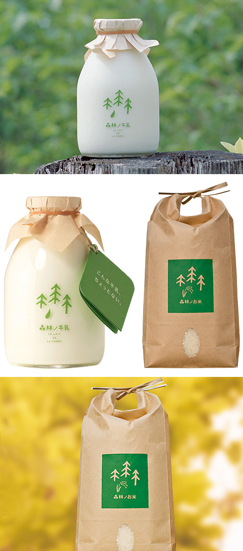
The second Japanese product of the week! I was immediately drawn to the sweet simplicity of this forest milk and rice. The forest imagery references the company's unique cattle ranch environment - cows graze in the forest rather than the fields. The packaging is minimal and unembellished, allowing the beauty of the product and the simple yet straightforward graphic to harmonize.
via The Dieline


1 comment:
I loooooooooooooove this packaging. love love love
Post a Comment