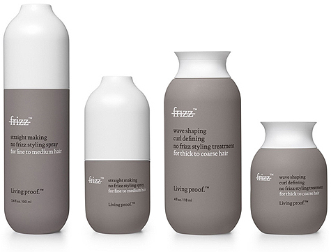
Living Proof's No Frizz packaging is gorgeous. The logo is brilliant and direct. The form is rather unique to other haircare products on the market, especially the bottles' caps.
My only change? I would to see all the straightening-related products with the large white caps (the silhouette looking like long, straight hair) whilst the curling products use the small white caps (the silhouette looking like one curl or wave). The image above shows the packaging in this manner, but their website shows the products going back and forth, using both cap forms for both products.
via The Dieline


No comments:
Post a Comment